You are hereCreating the Pink Menace™ comic book cover
Creating the Pink Menace™ comic book cover

You all remember the First Edition Cover of The Pink Menace™ published in January?
Right here on Herd of Cats?
Of course you do.
Well I thought it would be interesting (and generate content) to walk through the process that went into the creation of the final comic book cover. And maybe inspire some of you to generate any kind of content. Seriously... any.
Step 1: The Pink Menace™
Creating a new character is not something to take lightly. You need a theme and a physical likeness to work from. Fortunately we had Stormblade's Avatar from Xbox Live as a base model and pink as a theme. Not much to work with but...
What else do we need? Well... boots of course. A cape. A logo. Oooh... A hat!
His Avatar had an orange shirt and it took me a while to convince Photoshop to shade it from orange to pink. It would have been easier if Coxxorz had been awake but since it was before noon, I was on my own.
So I scoured the web for a whole two minutes and found what I needed. Several different attempts at close cropping different boots had me settle on the ones I used.
Here are the component part original images and the final result.

So, The Pink Menace™ character achieved. On to the next step.
Step 2: confusion and lost identity
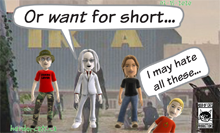
The original form of The Pink Menace™ wasn't the comic book cover you know and love. In fact, while the comic book cover was percolating in the depths of my mind, the first attempt at The Pink Menace™ was an HoC Live comic strip.
And just like every other HoC Live comic, it didn't really work.
The Zombie background used here was found with a google search (Zombie Desktop Backgrounds). I liked it so I used it in the strip. It was in landscape format which becomes important later.
I was unhappy with the Hoc Live strip and felt it deserved more. I sent it to Coxxorz for his thoughts and started talking about more.
- Email thread between Coxxorz and Blackwalt. Subject: Preliminary
BlackWalt: I am still thinking that some kind of comic book cover would be better...
Coxxorz: Then do the whole strip as a comic cover. You have lots of time.
Fine, be that way.
Step 3: The first cover
 So I had worked on a comic book cover simultaneously with the comic strip but I was not happy with the result.
I found this comic book cover to use as a rough (very) guide and started to create my own. I looked at a lot of covers but this was the one that stuck with me.
I had found a portrait background as well but it was a graveyard with only a single Zombie (that may have been a witch). Found it online all over the place and couldn't find the originator. Used it as a full photo background and copied the text box styles of the Beware comic and came up with this initial cover.
And I sent it to Coxxorz, again, for his thoughts:
- Email thread between Coxxorz and Blackwalt. Subject: Preliminary
Blackwalt: But what if this is the best I can do?
Coxxorz: Nothing wrong with that! But I kinda like the horde one with the flying.
Well you know what? Me too.
Step 4: background image, recovering the Zombie Horde
I also preferred the flying Pink Menace™ and preferred the Zombie horde background as well. But it was a landscape format and I needed a portrait image.
So I looked at the two images together for a while before a solution came to me...
Merge them together.
The general image tone was close enough that I thought I could get away with combining them. I cropped off the top (sky) from the Zombie image and laid it across the graveyard image. I then flipped the graveyard image horizontally and jackpot! A working cover background that was portrait image but preserved the Zombie horde we liked so much.
Close enough that most people wouldn't even notice.
Step 5: faking the motion
 In the first HoC Live strip attempt you may notice that the flying lines of The Pink Menace™ were straight pink lines. Boring and didn't really convey the movement aspect I was looking for. That's when I remembered one of the sample comic covers I had found earlier.
 It had excellent flight/motion lining for a jet chair flying out of a building almost off of the cover. Perfect, lets crop that out. After ten minutes of attempting to change the shades of yellow into shades of pink I decided that yellow ones would look fine. Just fine. Yellow is great. Stupid photoshop skills.
Step 6: putting it all together
- Pink Menace™ character? Check.
- background image? Check.
- Motion lines? Check.
- comic book layout? Check.
So my comic book cover is mostly complete but I found one thing I didn't like. In the original Beware comic the yellow rectangle in the top left worked fine. In my photo image background it stood out. And not in a good way.
If only I could figure out where to get a decent Zombie themed background?

It's okay, I knew you had already recognized the green, blood spattered background from left 4 Dead.
So I replaced the yellow with the awesome L4D background and I had my final comic book cover. Except for a few minor touches:
- I added in a month and issue number in the top right. Jan 10 and #01.
- I added in a barcode in the bottom right (from Call of Duty: World at War. Duh! That's where The Pink Menace™ spends all his time)
- added HoC Live and HerdofCats.ca into the barcode box
There, now I'm done...
Except...
Step 7: the things I forgot to mention... and should
Image work: There was a substantial amount of photoshop work involved. Just wanted to mention it. Coxxorz (the expert) didn't help at all so I had to struggle through on my own.
Layout: All the layout was done in Adobe Indesign.
Fonts: I searched longer for the fonts than I did for the component images. All of them are free and available online:
- BD Cartoon Shout
- YouMurderer BB
- Feast of Flesh BB
- Kronika
- SF Slapstick Comic Shaded (for one character!)
Aren't those some great names? Feast of Flesh! You Murderer! These names should be on the Comic Cover!
Okay. Maybe not that last one.
Step 8: all done. Can I go now?
Seriously. All done. Leaving now.
Feel free to let me know what you think in the comments. Don't hold back now.
Looking for a high resolution pdf to decorate your parents' basement with? Contact the author. Same address as the cat at the bottom of the page.
-

- Login to post comments
- 2260 reads


So, some of you know that The Pink Menace™ is my really old XBox 360 that Coxxorz (pwn call ... snigger) and Blackwalt decided would look much better if it had a pink faceplate to match my pink controller. These people are my friends ... technically. They did this after Blackwalt attempted to get it fixed after an RRoD (see, friends) as part of my Christmas gift. Because of this, it was hard to a)hate him more than I already do and b)remove it. Thus, the Pink Menace™ was born. Of course, one week later, it RRoD'ed again. Blackwalt took it back to the repair shop and had it fixed again. Shortly thereafer it, you guessed it, RRoD'ed again, along with his Core, which he had fixed at the same time and his Halo box, repaired by Microsoft.
This, I assumed was the end. TPM™ is going on four years old. Blackwalt had plans for a funeral for it and other dead 360s. Then he tried running his Halo box off his UPS and it worked! It's been fine ever since. He suggested I take TPM™ and try it at home, which I just did. As you can see, no RRoD.
For how long, who knows, but it's time to grab my matching (sort of) pink controller and kill some zombies!!!!
if I had done this, aku would be telling me that I 'have too much time on my hands. But apparently you only have too much time on your hands at work, so that's ok.
Anyway I did enjoy reading how you created the cover.
Merging the Zombies with the dark background worked well, and the side panels/barcode looks good too. Also the 'flying' motion lines don't look too bad, although the color seems a little out of place with the background. The only real problem is that Stormy looks like he is floating on the image, because there is no shading at all on him. You could use the burn tool, or better yet a brush with a mask, to adding some shadows. And for reference you can just look at the zombies below, to get some idea of rim shading.
Makes me think that I should do one of these for my Award winning Winnie-the-Pooh/Colossus entry. I used some fairly advanced Photoshop skillz on that one.
if I had done this, aku would be telling me that I 'have too much time on my hands. But apparently you only have too much time on your hands at work, so that's ok.
The Difference:
[Blackwalt please do not take offence]
Blackwalt is married with a kid(s?), this is not a bad thing, it's just that he has much more important things (wife, child etc) to think about and spend his time with. And when he has a few moments for himself he likes to play video games or use photoshop etc. which is a good thing because he needs his time as I am sure Guba and Blackwalt Jr. does as well.
YOU on the other hand and please do take offence.
Are single (and because beggars can't be choosers) you should be out there trying to get a girl or two and live life while you still can before you become that grumpy old man next door. Be social have fun etc. Now, of course you need your 'down time' every now and again. And I am sure you keep a stock of paper towels exactly for that. That is when you should play video games, practice your photoshop skills, or your self love techniques.
Notice when I am online most of the time it is usually to kill some time before one of my special friends come. Or it is just sometimes I want to just crack open a bottle of wine or beer and kill some time (this is rare).
Makes me think that I should do one of these for my Award winning Winnie-the-Pooh/Colossus entry. I used some fairly advanced Photoshop skillz on that one.
Case and Point.
when you critique the Photoshop skills of others, since Blackwalt, like me, has forgotten more about Photoshop than you will ever know.
that you keep saying that, even though you've shown nothing to back it up.
And you don't "forget" Photoshop. Unless you guys were experts at Photoshop version 1.0, where you could only draw simple shapes and lines, then I don't see how that makes sense.
I have nothing to prove to you. Actually I think 2.0 was the first version we used and we've been working in the industry for most of those years since. If you were really good at Photoshop, you would know there is lots you can forget when you are not using it every day. I would take up the challenge if I had the time to dedicate to it, but unfortunately I have a life.
Sounds like a Photoshop Challenge has been issued!
Although it's way more work than critiquing.
Someone else do the work by telling them you have no skill in the required application.