You are hereCall of Duty Zombie Mode Poster
Call of Duty Zombie Mode Poster
The design idea may not have been original but the result is still awesome
So while out for a Coffee run with our head designer we spotted an Ikea poster that had potential. "We could do something like that."
So I did.
Originally I was working on something to tie into the Super Secret Zombie LAN but we ran out of time and just used Zombie Army posters we found online.
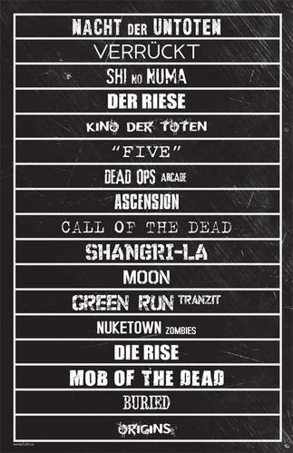
Then I found some spare time this weekend and started working on something involving fictional video game cities (Raccoon City, Silent Hill, Pacific City, etc) but then something Zombie happened. As a fictional location I tried Verrückt. Within seconds of typing Verrückt I erased all the other cities and started typing out Call of Duty Zombie Mode maps. I needed to add five more lines to the poster but I was okay with that. Seventeen different levels. We had done a graphic with all the zombie mode map names but it wasn't really something you could stick on the wall of your hovel.
Once I was happy with my poster I sent it off to our Head Designer. This before I realized that I had committed a major design flaw. I had used way too many fonts with a different font for each location. I only duplicated one font (by accident) which I left as is once I received our head designer's response, "It's perfect!"
So other than adding a faint watermark, a HoC logo, and our URL it was ready to go.
And here it is. If you don't want to use the smallish JPG an 11"x17" PDF version is available for download.
-

- Login to post comments
- 2030 reads

