You are hereHoC E3 UPDATE: New Xbox One Dashboard
HoC E3 UPDATE: New Xbox One Dashboard
Just to get it out there, the existing interface sucks

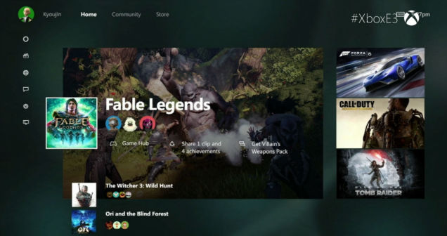
New Xbox One Interface Looks Way Different
Microsoft today unveiled the next iteration in its Xbox One user interface, and it looks significantly different from the original.
At the moment, the company is referring to it as the "New Xbox One Experience," and it brings a whole new look to your console's dashboard. According to the reveal trailer (watch it below), the home screen has been redesigned with a series of vertical and horizontal menu options. If anything, it looks more like the PlayStation 3's XMB than the original Xbox One's Metro UI's tile organization.
About damn time they tried to fix it.
Again, it is on the E3Expo Site somewhere but it is massively easier to find it directly on Gamespot.
-

- Login to post comments
- 220 reads


Looks like the Sony dashboard threw up on the Xbone dashboard.
But I guess the important thing is they're trying to fix it.